

Graphic design, web design, print design
and design-design.
Custom livery design for a high-end mountain bike manufacturer.
Making it stand out.
-

Dream it.
An example of a major design project is a 230-page product catalogue created for a national brand. The catalogue integrated five sub-brands, each with a unique layout and visual identity tailored to its brand image and marketing strategy. Designed with efficiency in mind, the file could be printed as a single comprehensive catalogue or separated into five individual catalogues, streamlining both print production and brand consistency.
-
Build it.
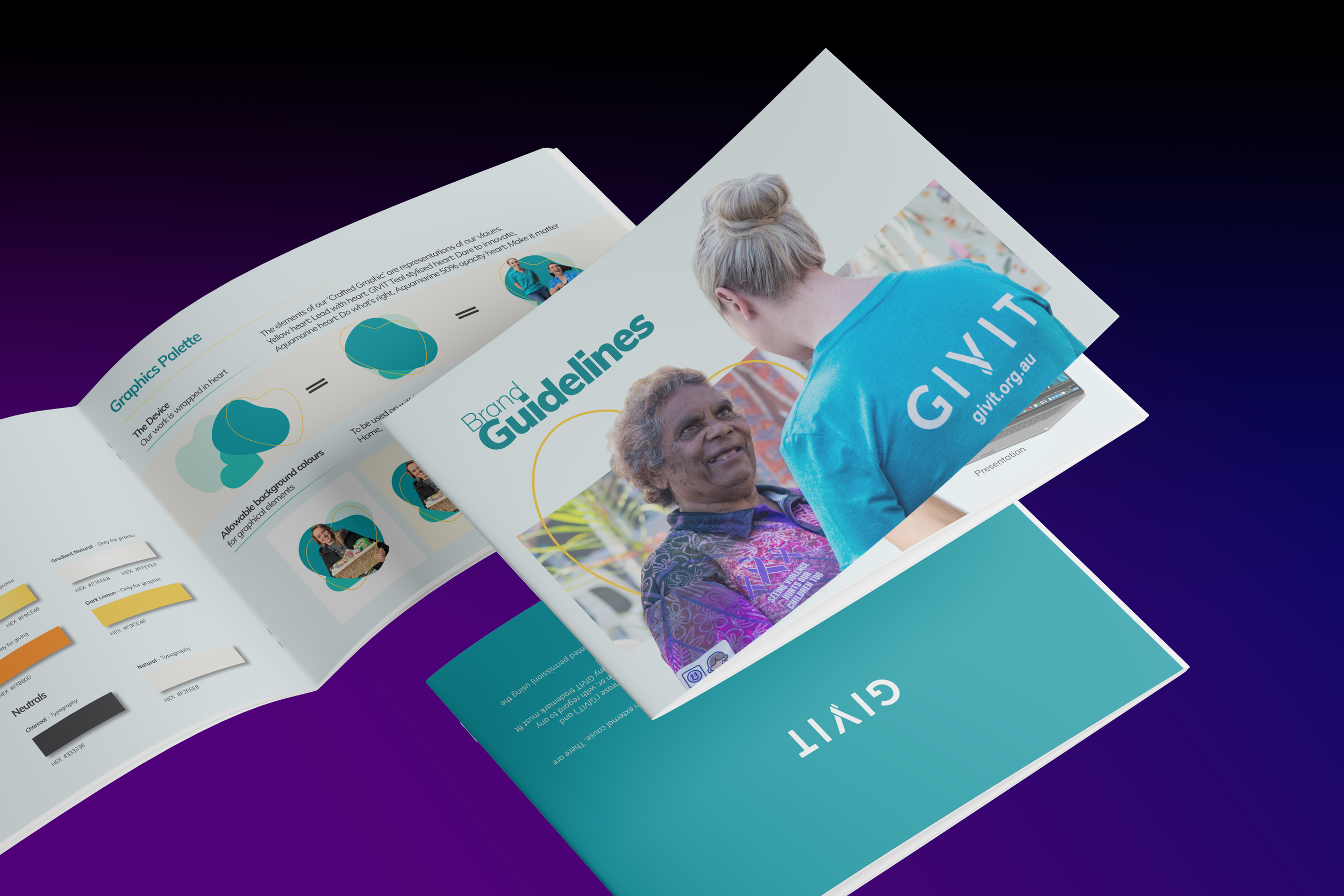
Development of the GIVIT brand guidelines, templates, and creative assets across web, digital, print, and video, ensuring a consistent, accessible, and on-brand visual identity for a national not-for-profit. From concept to production, the work balanced strategic brand systems with hands-on design execution, supporting integrated campaigns, storytelling, and high-impact community initiatives.
-

Connect it.
Developed through a co-design process, the Queensland TGD Service and Resources Guide brings complex health, social support and referral information into a clear, cohesive publication. A structured, colour-coded system organises gender-affirming care pathways by age and need, helping families, carers and professionals navigate Queensland services and make informed, appropriate referrals.
Queensland Connected Communities

Queensland Connected Communities was developed to help trans, gender-diverse and non-binary young people, families and professionals navigate Queensland’s health and social-support systems.
The challenge was to transform a large amount of detailed information—including care pathways, service eligibility and referral requirements—into resources that felt clear, practical and welcoming. The design also needed to accommodate different ages, needs, locations and stages of gender affirmation.
A flexible visual system was created using strong typographic hierarchy, structured templates and colour-coded sections. In the Queensland TGD Service and Resources Guide, information is organised across social, medical, mental-health, legal and allied-health needs. Consistent service profiles help readers compare eligibility, locations, referral processes and available support.
The broader project included a coordinated suite of print and digital resources, including fact sheets, booklets, care-planning materials, a gender-journey diagram and graphics for educational videos.
Developed through consultation with the Project Working Group and people with lived and living experience, the project turns a complex service landscape into practical, affirming resources that support clearer pathways to care across Queensland.
Services
Publication design, information design, digital and print resources
Client
Transcend Australia
United Colours of Pride

United Colours of Pride was developed as a bold campaign system celebrating the 12 colours of the Inclusive Pride flag and the people and communities they represent.
The challenge was to communicate the meaning behind each colour without becoming overly complicated or instructional. The campaign needed to be educational, visually powerful and flexible enough to support Brisbane Pride’s diverse program of events.
A colour-led visual system was created using bold typography, community imagery and unapologetically graphic layouts. Each application carries its own message while remaining part of one recognisable and cohesive Pride campaign.
The broader project included coordinated social and print resources for the Queens Ball, Launch Party, Rally & March, Fair Day and other Brisbane Pride activities. The system was designed to move confidently between social content, posters, signage and printed collateral without losing its impact.
Created from within the community, the campaign makes visibility central to the design—ensuring every part of the Inclusive Pride flag is represented. The result is a campaign built to stop the scroll, share knowledge and bring the community together.
Services
Campaign design, visual identity, social media design and print resources
Client
Brisbane Pride
Proud 2 Play
Active Rainbow Families
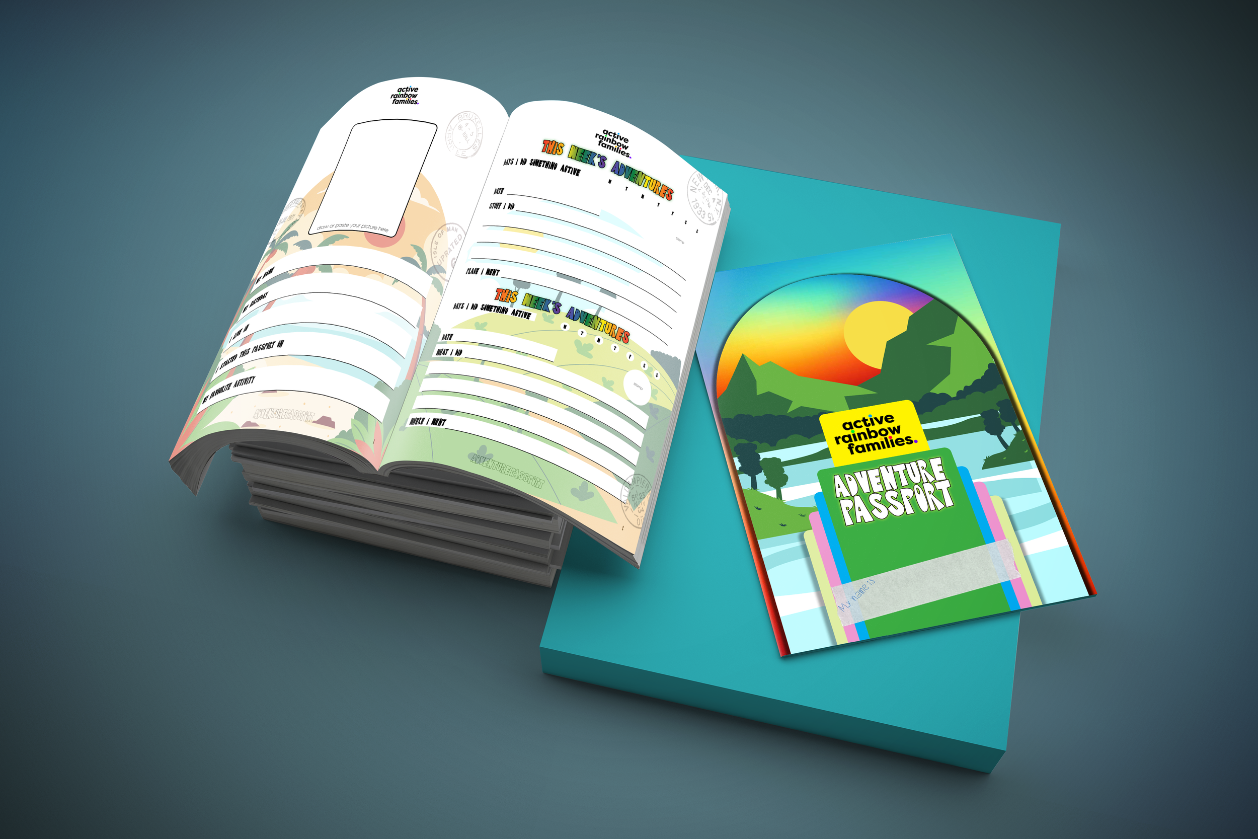
The Adventure Passport for Active Rainbow Families was designed as an engaging, accessible publication that combined playful visual storytelling with clear, inclusive branding. From concept to final layout, the design balanced creativity and usability, delivering a cohesive print-ready resource that supports family engagement and community connection.
Client
Proud 2 Play
Domino’s Pizza
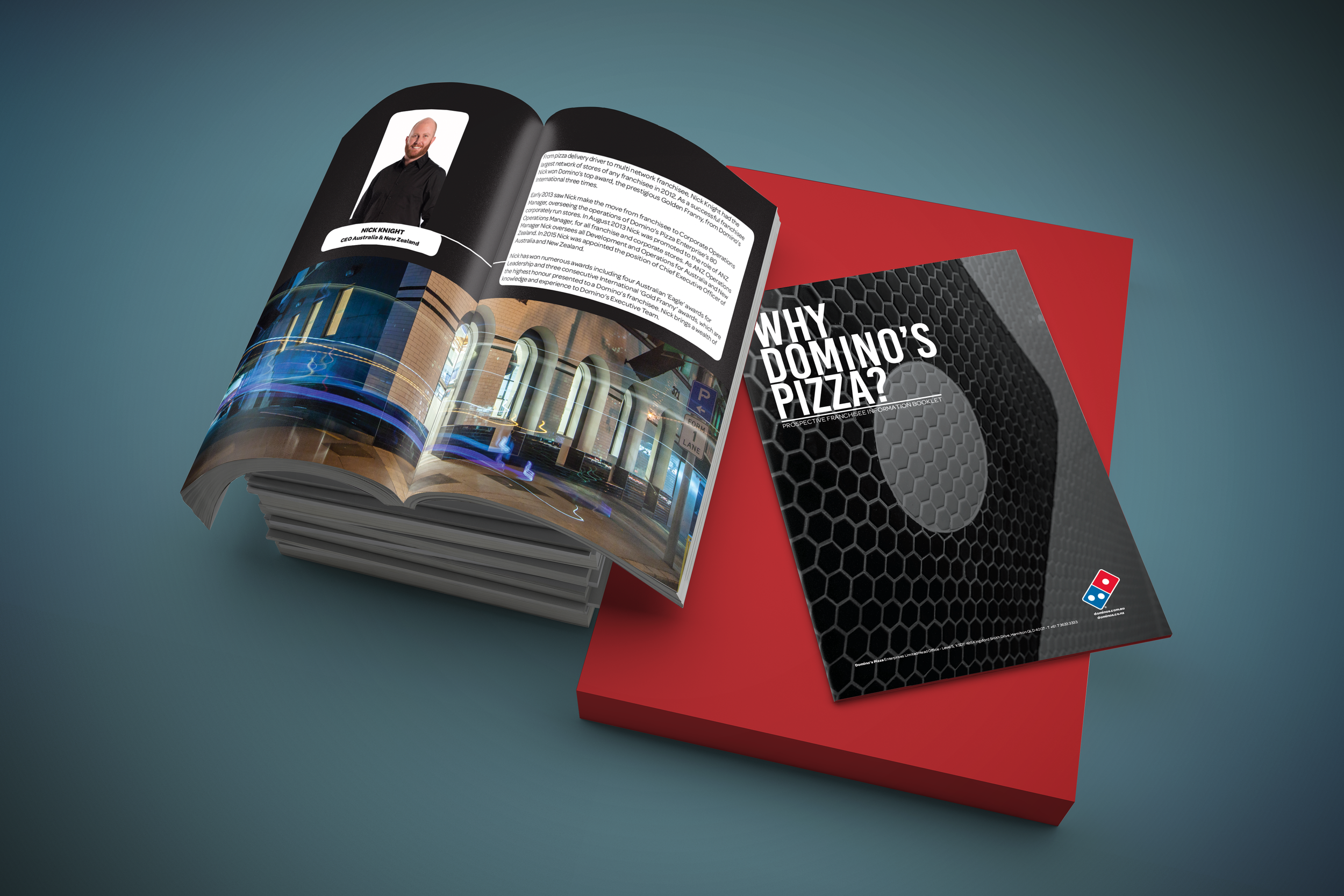
The Domino’s Pizza Enterprises franchisee information booklet was designed as a clear, engaging and brand-aligned publication for potential franchise partners. Developed for national use and later adapted as a flexible template for international markets, the design ensured consistency, readability, and scalability across multiple regions and audiences.
Client
Domino’s Pizza Enterprises

At Gay Skate, the multi-award-winning roller skating & community event, I bring my skills in event promotion, design, photography, videography, and DJing to create all-ages experiences that celebrate the LGBTIQAP+ community, families, friends, and allies. From bold merch to immersive event storytelling, I help showcase queer pride and roller skating culture in ways that connect, inspire, and keep the wins rolling.

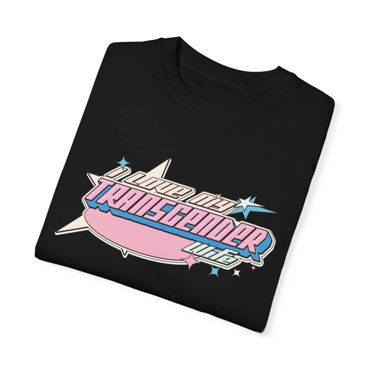
Apparel.
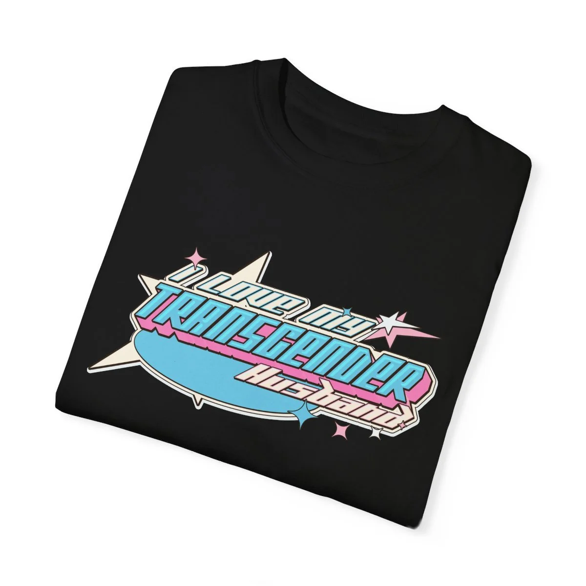
I design graphics for apparel that combine bold messages with stylish, fun, and engaging designs. From expressive streetwear and community pride pieces to more traditional team uniforms and corporate apparel, my work blends creativity with purpose to make every garment stand out.



Banners that make a statement, bold, eye-catching, and never afraid to push creative rules & boundaries.
WEBSITES SHOULDN'T BE BORING
WEBSITES SHOULDN'T BE BORING

Designing traditional and e-commerce websites across platforms like WordPress, Shopify, and Squarespace.
